Your brand is growing. New team members. External partners. Multiple platforms. Suddenly, your logo appears in three different shades of blue. Your fonts are all over the place. Your messaging sounds like it’s coming from five different companies.
Sound familiar?
This is where brand guidelines save the day. They’re not just a fancy PDF that sits in a forgotten Google Drive folder. They’re the rulebook that keeps your brand consistent, recognisable, and scalable.
Let’s break down exactly what you need to know.
What Are Brand Guidelines, Really?
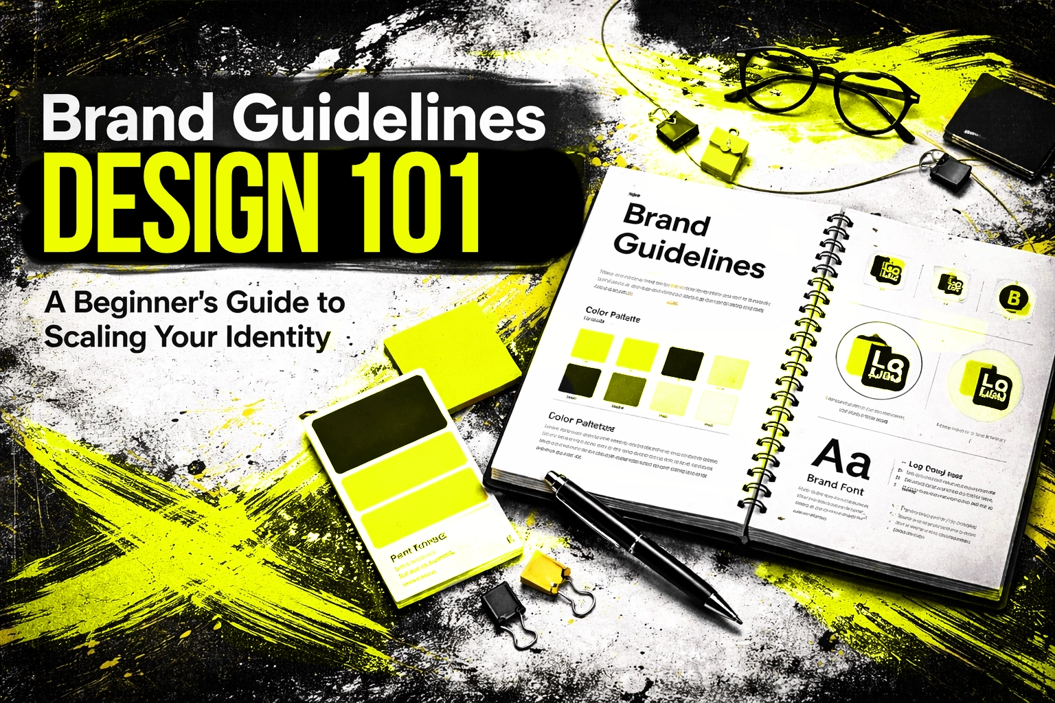
Brand guidelines are your brand’s instruction manual. Simple as that.
They define how your brand looks, sounds, and feels across every touchpoint. Website. Social media. Packaging. Email signatures. Business cards. Everything.
Think of them as a contract between your brand and everyone who touches it. Your team. Freelancers. Agencies. Print shops. They all need to know the rules.
Without guidelines? Chaos. Brand dilution. Confused customers. Lost trust.
With guidelines? Consistency. Recognition. Professional credibility at every turn.

Why Guidelines Matter When You’re Scaling
Here’s the thing. When it’s just you or a small team, brand consistency is easy. You know the colours. You know the tone. It lives in your head.
But growth changes everything.
New hires don’t have your institutional knowledge. External designers interpret your brand differently. Marketing agencies make assumptions. Suddenly, your brand identity fragments.
Brand guidelines solve this by:
- Creating a single source of truth. No more guessing games.
- Saving time. Teams work faster with clear direction.
- Protecting brand equity. Consistency builds recognition and trust.
- Enabling autonomy. People can create on-brand content without constant approval.
The bigger you grow, the more critical these guidelines become.
The Core Foundation: Start Here
Before diving into colours and fonts, nail down your brand essence. This is the why behind everything visual.
Mission. What does your business exist to do?
Vision. Where are you heading?
Values. What principles guide your decisions?
Purpose. Why should anyone care?
This foundation shapes every other decision. Your visual identity should be an expression of these elements, not just aesthetic choices made in isolation.
Document these clearly at the start of your guidelines. Anyone reading should immediately understand what your brand stands for.
Visual Identity: The Non-Negotiables
This is where most people start: and for good reason. Visual consistency is immediately noticeable when it’s wrong.
Logo Usage
Your logo is sacred. Treat it that way.
Define:
- Minimum size. How small can it go before becoming illegible?
- Clear space. How much breathing room does it need?
- Colour variations. Full colour, single colour, reversed, monochrome.
- Placement rules. Where should it sit on different materials?
- What NOT to do. Stretch it. Recolour it. Add effects. Show examples of incorrect usage.
Be specific. “Don’t make it look weird” isn’t helpful. Show exactly what’s acceptable and what isn’t.
Colour Palette
Colours trigger emotional responses. They also trigger brand recognition: think Coca-Cola red or Cadbury purple.
Document your colours with exact codes:
- HEX for digital
- RGB for screens
- CMYK for print
- Pantone for precise colour matching
Include primary colours (your main brand colours) and secondary colours (supporting palette for variety). Explain when to use each and in what proportions.
Typography
Fonts carry personality. A tech startup using Comic Sans sends a very different message than one using Helvetica.
Specify:
- Primary typeface for headlines
- Secondary typeface for body copy
- Web-safe alternatives when brand fonts aren’t available
- Hierarchy rules. Font sizes, weights, line heights for different contexts.
Include examples. Show how headlines, subheads, and body text should look together.

Imagery Style
Photography and graphics need consistency too.
Define:
- Photography style. Candid or posed? Bright or moody? People or products?
- Colour treatment. Filters, saturation levels, colour grading.
- Composition preferences. Cropping rules, perspective, framing.
- Illustration style. If you use illustrations, what’s the aesthetic?
Show examples. Create a mood board. Make it visual: because this section is all about visuals.
Icons and Graphics
If you use iconography, standardise it.
- Style. Outlined, filled, rounded, sharp?
- Stroke weights. Keep them consistent.
- Colour application. Single colour? Multi-colour? When?
- Size and spacing. How do they sit alongside text?
Small details. Big impact on perceived professionalism.
Tone of Voice: How Your Brand Speaks
Visual identity gets most of the attention. But words matter just as much.
Your tone of voice defines:
- Personality. Are you friendly? Authoritative? Playful? Serious?
- Language choices. Technical jargon or plain English?
- Sentence structure. Long and flowing or short and punchy?
- Dos and don’ts. Words you always use. Words you never use.
Include examples of on-brand and off-brand copy. Show the same message written correctly and incorrectly.
This section is crucial for anyone writing on behalf of your brand: copywriters, social media managers, customer service teams.
Building in Flexibility
Here’s where many guidelines fail. They’re too rigid.
Brands need room to breathe. Trends shift. Platforms have different requirements. Creativity needs space.
Balance structure with flexibility.
Lock down the essentials:
- Logo
- Core colours
- Primary typography
- Key messaging
Allow flexibility in:
- Secondary colour application
- Photography within defined parameters
- Headline treatments for campaigns
- Platform-specific adaptations
Your guidelines should enable creativity, not stifle it. Define the boundaries, then let people play within them.
Making Your Guidelines Actually Useful
A 200-page PDF nobody reads is worthless. Accessibility matters.
Keep it clear. Avoid jargon. Write for someone who’s never seen your brand before.
Make it visual. Show, don’t just tell. Examples beat descriptions every time.
Keep it updated. Brands evolve. Guidelines should too. Schedule regular reviews.
Make it accessible. Cloud-based. Easy to find. Easy to share. Not buried in someone’s email attachments.
Train your team. Don’t just hand over a document. Walk people through it. Answer questions.
The best guidelines are living documents that people actually use.
Common Mistakes to Avoid
Being too vague. “Use bright colours” means different things to different people. Be specific.
Being too rigid. Guidelines that don’t allow any flexibility get ignored or worked around.
Forgetting digital. Your brand lives online. Include social media templates, email signatures, website specifications.
Skipping the why. People follow rules better when they understand the reasoning. Explain your choices.
Never updating. A guideline from 2018 probably doesn’t cover your TikTok presence. Keep evolving.
Ready to Scale?
Brand guidelines aren’t about bureaucracy. They’re about empowerment.
They give your team confidence to create. They give external partners clarity. They give your brand consistency.
And consistency builds trust. Trust builds recognition. Recognition builds growth.
Start simple if you need to. Cover the essentials first. Build from there.
Your future self: and your future team: will thank you.