Your website loads in 0.3 seconds. Your app has zero bugs. Your interface checks every accessibility box.
And yet, it feels cold.
We’ve reached a strange point where digital products work brilliantly but connect poorly. Everything functions. Nothing resonates. You’re left with technically perfect experiences that somehow miss the mark entirely.
This isn’t a technology problem. It’s a human one.
The automation trap
Here’s what happens: A company builds a product. They automate everything they can. They optimize for efficiency. They A/B test their way to “better” metrics. And somewhere along the line, they forget they’re designing for actual people: not data points.

You see it everywhere. Chatbots that sound like chatbots. Emails that read like they came from a script. Interfaces built for engineers, by engineers. The tech works. The experience doesn’t.
The irony? Technology was supposed to make life easier, more connected, more accessible. Instead, we’ve built digital walls between brands and the people they serve.
What human actually means
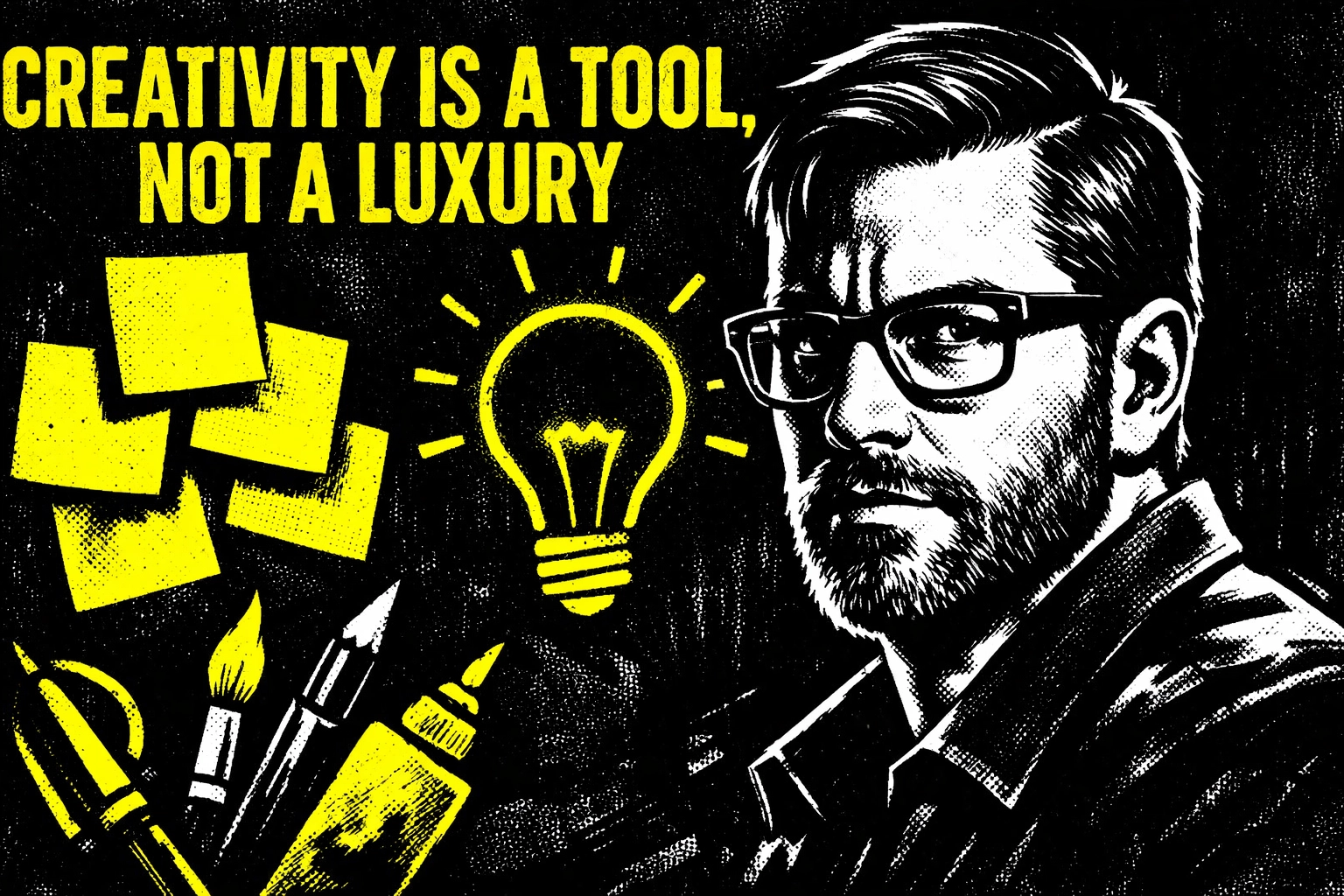
Human design isn’t about adding a friendly font or throwing in some emoji. It’s about understanding what people actually need, how they actually think, and where they actually struggle.
Start with empathy. Real empathy: not the version where you assume you know what users want because you’ve read some analytics. You need to see the world through their eyes. What frustrates them at 3pm on a Tuesday? What makes them abandon a checkout flow? What do they actually care about?
Apple gets this. So does Airbnb. Their products don’t just function: they anticipate. They remove friction you didn’t even know existed. They make complex things simple without making you feel stupid.
That’s the difference. Human design reduces cognitive load. It meets you where you are. It doesn’t make you work harder to understand it.

Problem-solving over feature-stacking
Most companies solve the wrong problem. They build features users never asked for. They fix symptoms instead of root causes. They chase competitors instead of listening to their own customers.
Human design starts with the actual problem. Not the one you think exists. The one that actually keeps your users up at night.
You can’t fake this part. You need to talk to people. Watch how they use (or don’t use) your product. Ask better questions. Go beyond “What do you want?” to “What’s making this hard for you right now?”
Different people need different things. Your power user isn’t your casual browser. Your tech-savvy millennial isn’t your digitally cautious senior. One interface size doesn’t fit all: and pretending it does is lazy design.
Build, test, break, repeat
Perfect products don’t exist. Perfect first attempts definitely don’t exist.
Human design means you build something, put it in front of real people, watch them struggle (because they will), then fix it. You repeat this until the struggles disappear. It’s messy. It takes longer. It works.

This is where most companies bail. They want to launch fast. They skip the testing phase. They assume their internal team represents their users. Then they wonder why adoption rates tank.
Your internal team has been staring at this product for months. They know every shortcut, every hidden feature, every workaround. Your users don’t. They open your product for the first time and judge it in seconds.
Test with people who don’t work for you. People who didn’t build it. People who don’t care about your clever solution to a technical problem you created.
Think bigger than the screen
Your product doesn’t live in isolation. It’s part of someone’s day. It connects to other tools. It exists within a workflow. It competes for attention with everything else in their life.
Good design considers the ecosystem. What happened before they opened your app? What do they need to do after? How does this fit into the bigger picture of their goals?
This is systems thinking. You’re not designing a button. You’re designing an experience that spans touchpoints, devices, and contexts. Miss this, and you’ve optimized the wrong thing.
What this actually looks like
Human design is invisible when it works. You don’t notice it because everything just makes sense.
You can find what you need without hunting. You can complete tasks without reading a manual. You can recover from mistakes without feeling stupid. The interface gets out of your way and lets you do what you came to do.
That’s the goal. Not to impress people with your design skills. To help them accomplish something that matters to them.
When you get it right, you create products people actually want to use. Not because they have to. Because the experience doesn’t suck.

The risk of skipping this
You can build products without empathy. You can launch without testing. You can design for metrics instead of humans.
You’ll just end up with something nobody wants to use.
The cost shows up later. In support tickets. In abandoned carts. In users who leave and never come back. In reviews that say “It works, but…”
Human-centered design reduces that risk. It finds problems you didn’t know existed. It creates solutions that actually fit how people work. It builds products that don’t require constant explanation.
Start where people are
You don’t need to revolutionize everything at once. You just need to start paying attention.
Who’s using your product? What are they trying to accomplish? Where do they get stuck? What would make their experience better: not cooler, not more impressive, just better?
Ask those questions. Listen to the answers. Then build something that actually helps.
That’s human design. It’s not complicated. It’s just intentional.
The digital age doesn’t have to feel cold. You just have to remember you’re designing for people, not processors.
Human design isn’t a trend. It’s the difference between products people tolerate and products people actually want. Build for the latter.