– Logo
– Brand Identity
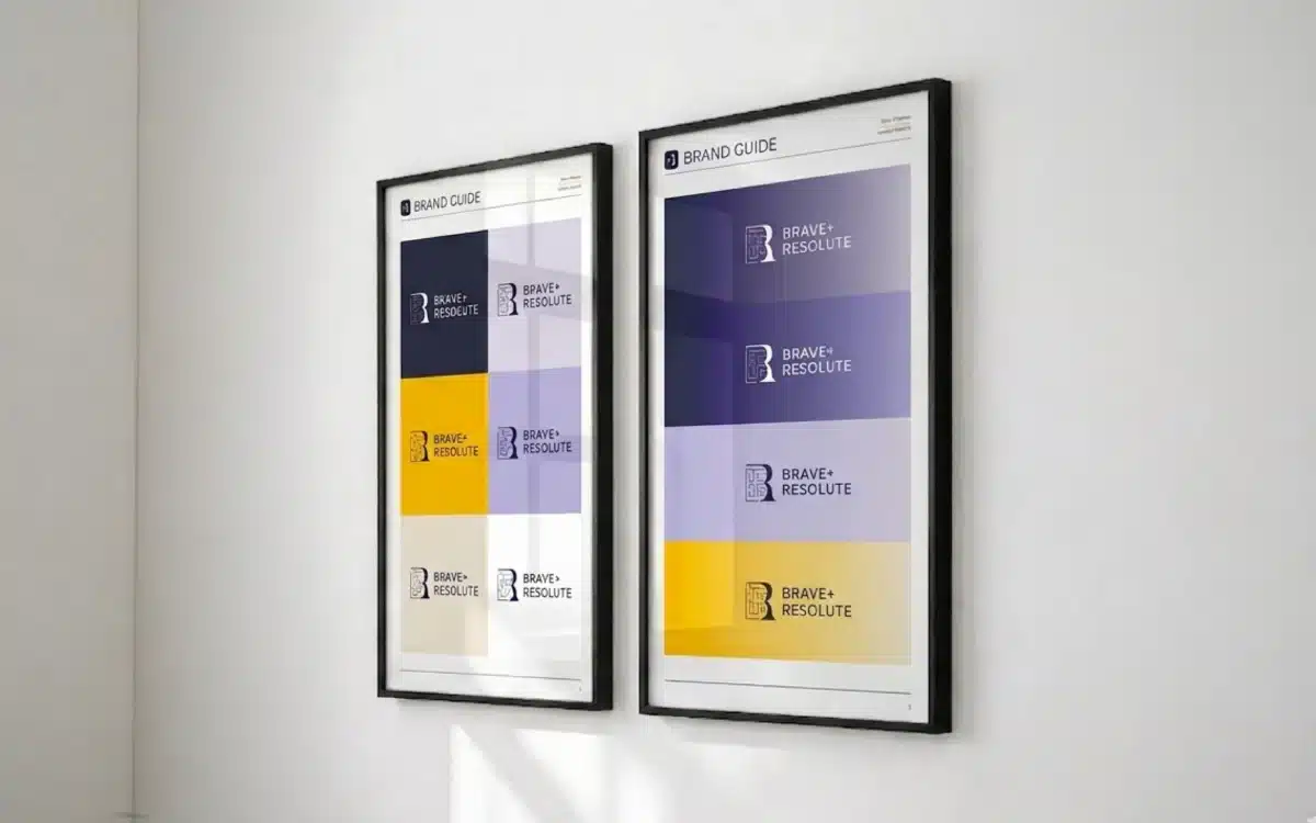
– Brand Guide
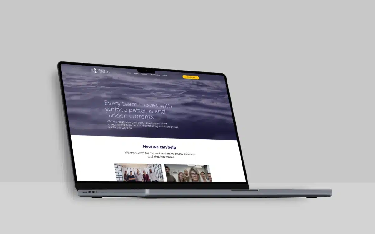
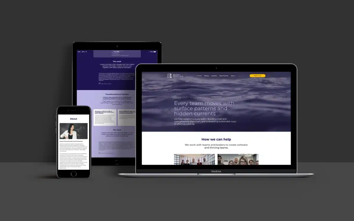
– Website
– Ongoing brand support
Brave & Resolute presents with the authority and psychological depth that Daphne’s work has always warranted. The brand communicates substance before a meeting is booked. The website functions as a genuine business development tool — educating, qualifying, and building trust around the clock.


Daphne Chung had built something quietly formidable. Over twenty years in strategy consulting, leadership development, and organisational psychology, she’d developed a practice that works with senior leaders and teams across financial services, technology, education, and professional services. Her credentials are exceptional — an ICF-accredited coach, a Cornell-certified conflict resolution specialist, a visiting executive coach at London Business School. Her client testimonials read like case studies in transformation.
But the brand told a different story.
The existing identity looked and felt like a business at an earlier stage. The visual language was dated. It lacked the gravitas and sophistication that Daphne’s work demanded. When prospective clients — regional directors, SVPs, founders — encountered the brand online, the gap between what they saw and what they’d experience was significant. In executive coaching, credibility is established before the first session. A brand that undersells the work doesn’t just underperform — it actively undermines the positioning.
The brief was straightforward: create a brand identity and website that reflects the seniority of the client base, the depth of the methodology, and the authority of someone who operates at the intersection of psychology, strategy, and leadership. All within three to four weeks.
We began with the question that drives every brand project worth doing: what does this business need to communicate before a single word is read?
The answer shaped the entire direction. Brave & Resolute doesn’t sell a commodity service. It works with leaders and teams navigating complex dynamics — the kind of challenges that sit beneath the surface of organisational life. Daphne’s methodology explicitly addresses what she calls “hidden currents” — the emotional patterns, systemic pressures, and unconscious dynamics that shape how teams actually function, beyond the visible processes and structures.
That’s a sophisticated proposition. It needed a brand that communicated sophistication without pretension, authority without rigidity, and warmth without softness.
We mapped the competitive landscape. Executive coaching brands tend to fall into predictable camps: corporate and clinical, or warm and vague. The clinical brands look credible but feel impersonal. The warmer brands feel approachable but lack the gravitas that senior leaders expect. Brave & Resolute needed to occupy a different space — one that signals psychological depth and commercial seriousness in equal measure.
The name itself gave us something to work with. “Brave & Resolute” carries weight. It implies courage, conviction, and resilience — qualities central to the leadership work Daphne delivers. The brand needed to honour that.
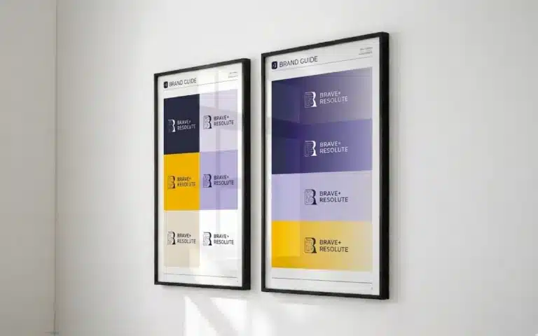
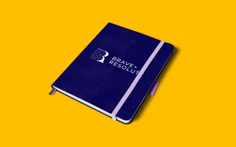
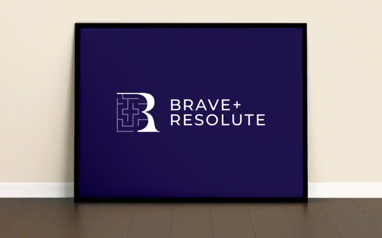
The colour palette became the foundation of the brand’s personality. We built the system around deep, grounded tones — a rich navy-purple as the primary colour, balanced with soft lavender accents and warm neutrals. The effect is deliberate: it communicates depth, calm authority, and psychological sophistication without defaulting to the cold corporate blues that dominate the coaching industry. An amber-gold accent runs through the calls to action and key brand moments, introducing energy and warmth into a palette that could otherwise feel too restrained.
Typography was kept clean and consistent. Montserrat carries the brand across every touchpoint — headings, body text, navigation, and calls to action. It’s a typeface that works at large display sizes without losing clarity at smaller scales. The weight variation between headings and body copy creates a clear hierarchy, and the overall effect is modern, readable, and quietly confident. No decorative flourishes. No competing typefaces. Just clarity.
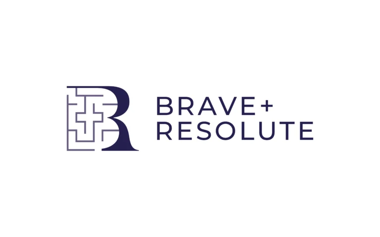
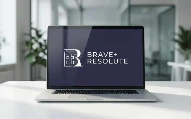
The logo uses a distinctive “+” between Brave and Resolute — a small but purposeful detail. It signals connection, partnership, and the bringing together of complementary forces. It scales cleanly across digital applications and sits comfortably alongside client brands without competing for attention.
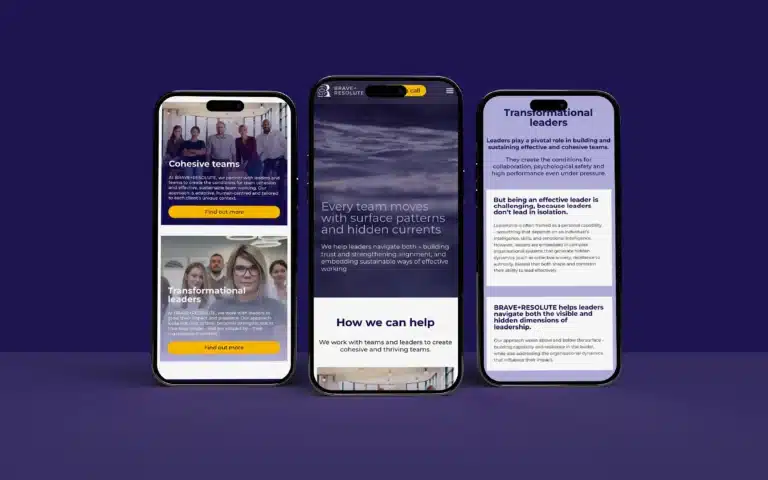
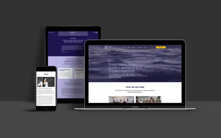
We designed and built a single-page site — a deliberate architectural decision. Brave + Resolute’s audience is senior. They’re time-poor. They don’t want to navigate through six pages to understand whether this is the right coaching partner. A single-page structure delivers the full proposition in one flowing narrative: what the business does, who it serves, how it works, what others say about it, and who’s behind it.
The homepage opens with the brand’s central metaphor — surface patterns and hidden currents — immediately signalling that this is a practice operating at a different level of depth. The content architecture mirrors the two core service pillars: Cohesive Teams and Transformational Leaders. Each section explains the approach without jargon, connecting Daphne’s psychodynamic methodology to tangible outcomes that senior stakeholders care about.
Social proof is positioned strategically throughout, not corralled into a single testimonials page. Client endorsements from SVPs, founders, and senior leaders in education and financial services appear at key decision points in the scroll — reinforcing credibility precisely when the visitor needs it.
The testimonial carousel in its own dedicated section uses a clean card-based layout, allowing visitors to browse multiple endorsements without leaving the page flow. Each testimonial is attributed with name, role, sector, and geography — the kind of specificity that builds confidence with a discerning audience.
We built on WordPress with Elementor, giving Daphne a platform she can manage independently — updating content, refining messaging, and evolving the site as the practice grows. The Calendly integration for booking exploratory calls is threaded through the entire experience, appearing at natural decision points rather than being confined to a single contact page. The booking flow is frictionless: one click to schedule a complimentary consultation.
The site is responsive, fast-loading, and optimised for the mobile experience — critical for a business whose prospects are as likely to encounter the brand on a phone between meetings as they are on a desktop.
The project delivered in three to four weeks, from initial conversations to a live site.
The qualitative impact is immediate. Brave & Resolute now presents with the authority and psychological depth that Daphne’s work has always warranted. The brand communicates substance before a meeting is booked. The website functions as a genuine business development tool — educating, qualifying, and building trust around the clock.
Your existing brand might be
confusing your best customers.