– Creative Direction
– Brand Identity
– Brand Guide
– Website
– Iconography
– Ongoing brand support
ACT Community had a strong logo but no brand architecture to support its mission of helping elite athletes transition into business careers. We built a complete visual identity system, designed a digital platform serving three distinct audiences, and created a scalable template framework — all within three months. The result: a cohesive brand that communicates substance and professionalism across every touchpoint.

ACT Community sits at an unusual intersection. They connect elite athletes with businesses looking for high-performance talent. Not a recruitment agency. Not a charity. Something new — a community platform bridging two worlds that rarely speak the same language.
When ACT approached us, the foundation existed but the house didn’t. They had a solid logo and clear values. What they lacked was everything surrounding it: no defined colour palette beyond the basics, no typography system, no imagery guidelines, no consistent messaging framework. Three very different audiences — athletes navigating career uncertainty, HR leaders seeking exceptional talent, and sporting organisations supporting their people — were all receiving the same undifferentiated communication.
The athlete career transition space doesn’t have established visual conventions. Unlike healthcare or finance, there’s no shorthand an audience instantly recognises. That’s both a challenge and an opportunity. ACT needed a brand identity that felt credible to corporate HR directors and approachable to a retiring athlete searching for what comes next.

We started by mapping what ACT actually does, not what they sell.
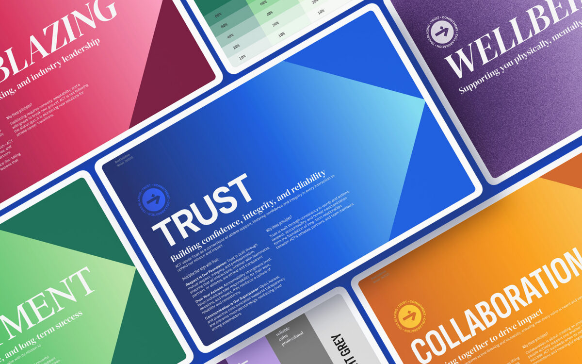
ACT Community operates across six distinct zones: Community, Careers, Ventures, Learning, Health & Wellbeing, and Transition. Each zone serves different needs at different stages of an athlete’s journey. That complexity needed to feel simple — not dumbed down, but organised.
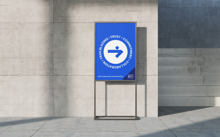
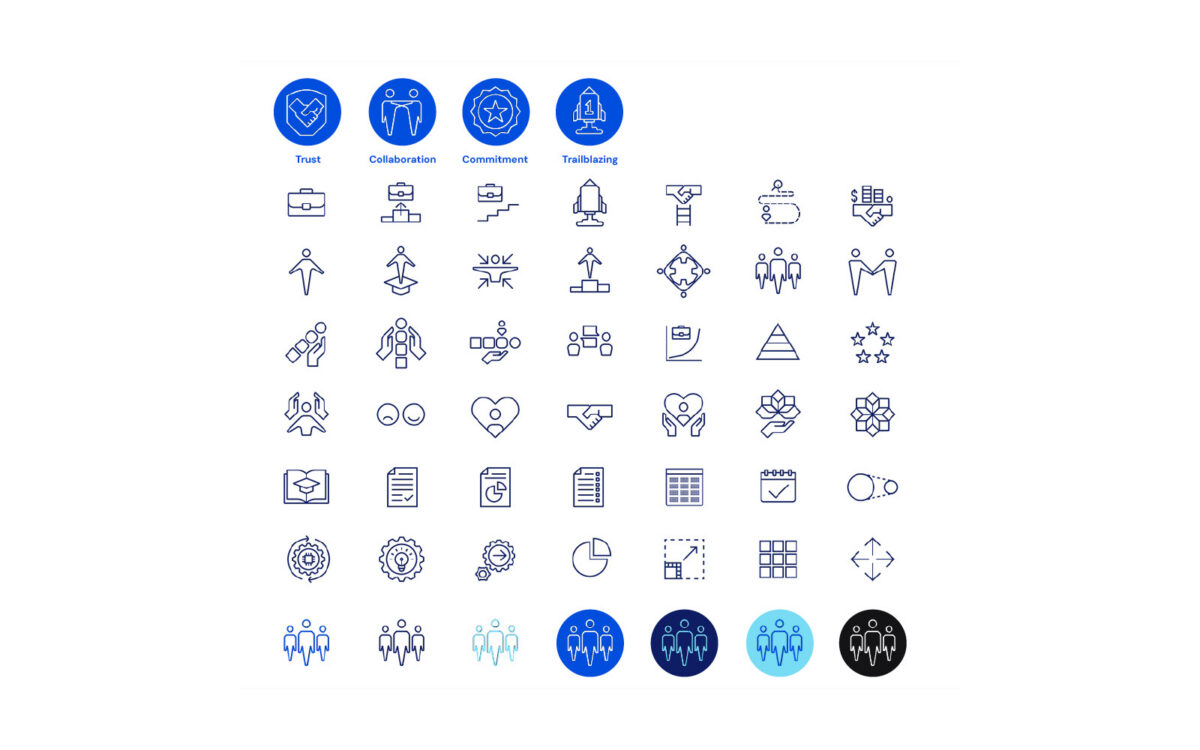
Their four core values — Trust, Collaboration, Commitment, and Trailblazing — aren’t corporate wallpaper. They’re operationalised through twelve Principles of Excellence that guide daily behaviour. “Champions Always Show Up” isn’t a motivational poster. It’s a cultural expectation. “Innovation is in Our DNA” isn’t aspiration. It’s a commitment to building solutions that don’t exist yet.
This gave us our strategic foundation. ACT isn’t following a playbook. They’re writing one. The brand needed to reflect that pioneering energy while maintaining the credibility that corporate partners demand.
Brand guidelines aren’t a PDF that gets emailed once and forgotten. They’re an operating system.
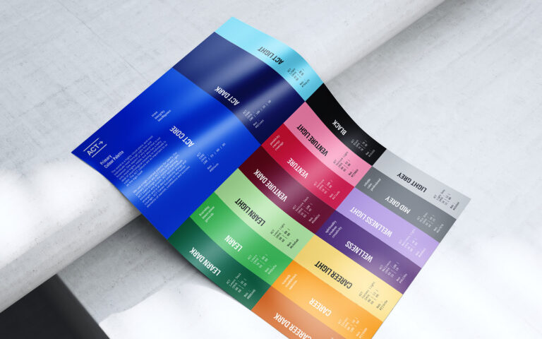
We built ACT’s brand architecture to scale. The colour palette does double duty: a primary system establishes brand recognition, while secondary colours map to each of the six zones. This means a Careers webinar looks distinct from a Wellbeing resource pack, but both are unmistakably ACT Community.
Typography follows the same logic. Primary and secondary typefaces cover digital and print, with clear hierarchy for headers, subheaders, body text, and captions. We specified HEX, RGB, and CMYK values — because a brand that looks different on LinkedIn than it does on a printed welcome pack isn’t a brand. It’s a collection of accidents.
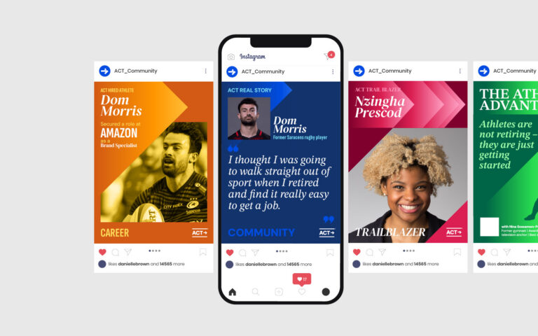
Imagery guidelines moved beyond the obvious. No generic stock photography of athletes shaking hands with suited executives. We defined a photography style that captures authenticity: real moments, candid energy, the tension between sporting intensity and professional composure. Image treatment rules ensure consistency without sameness.
The graphic system — icons, patterns, textures — gives the team creative flexibility within clear boundaries. Every element we designed answers the same question: does this make ACT look like the only organisation doing what they do?
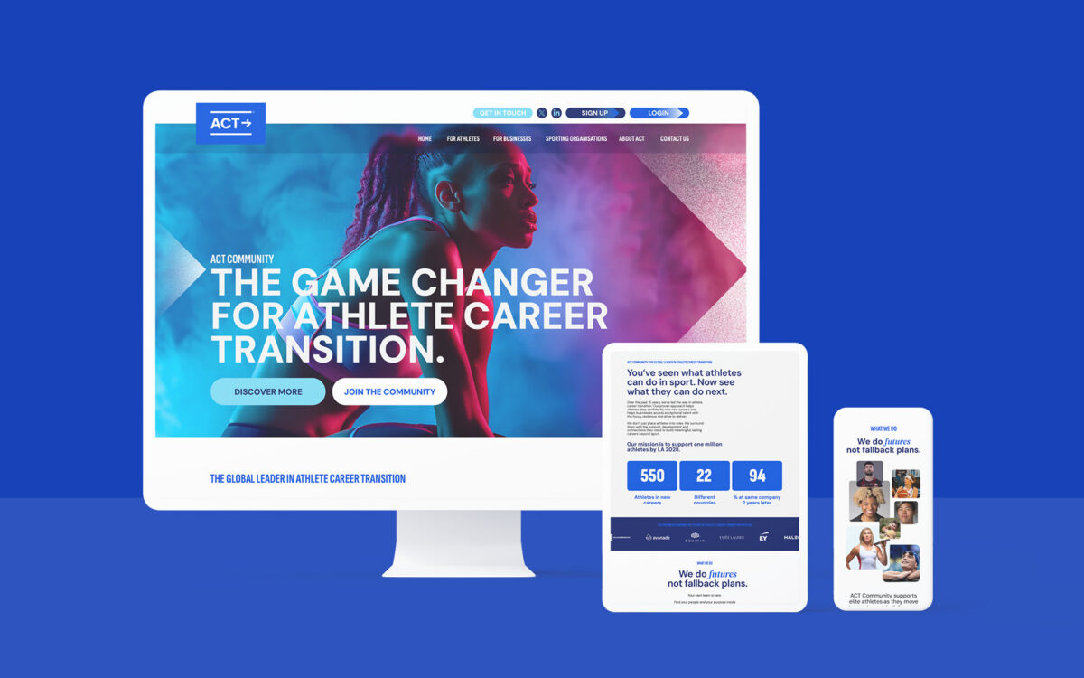
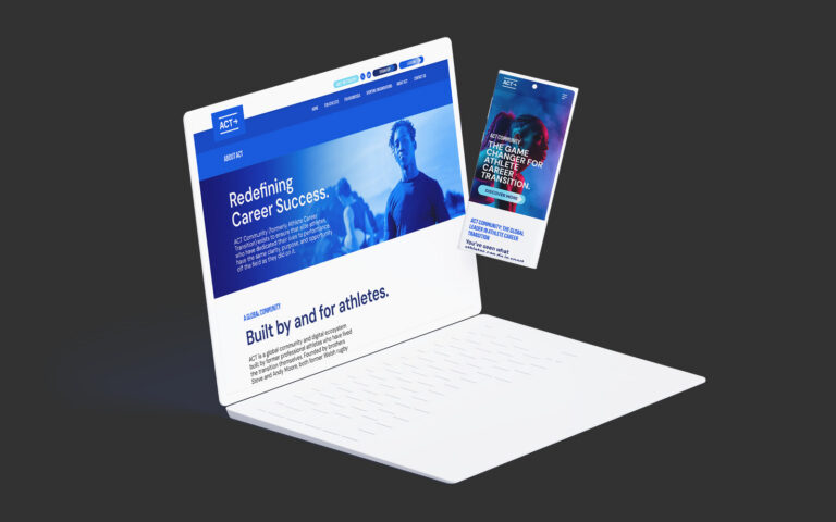
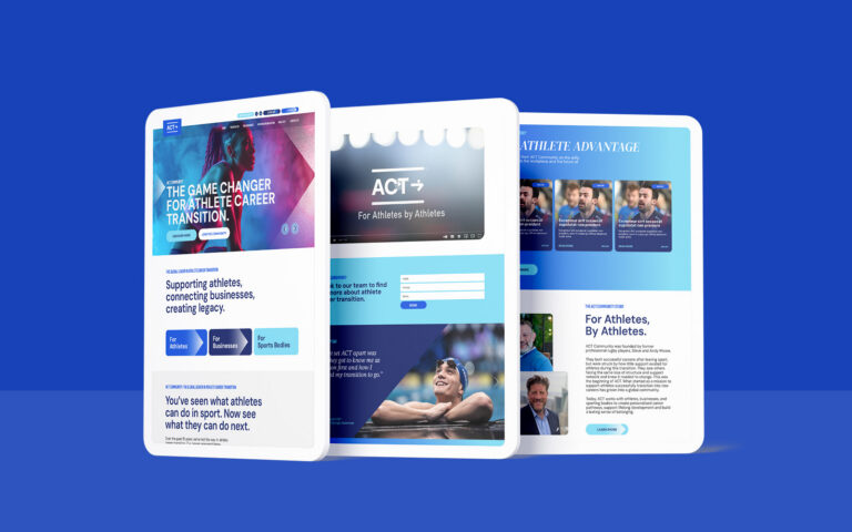
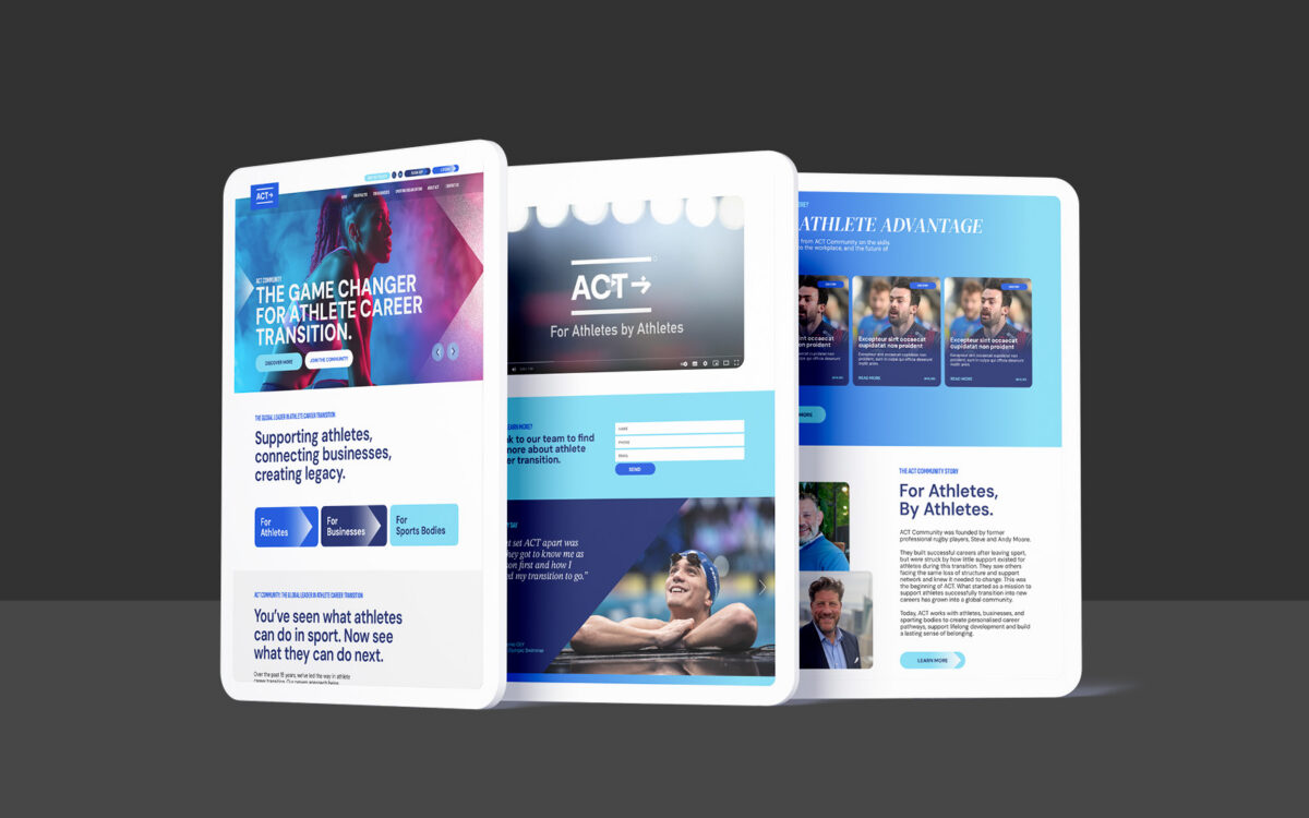
The website needed to serve three audiences without feeling like three websites.
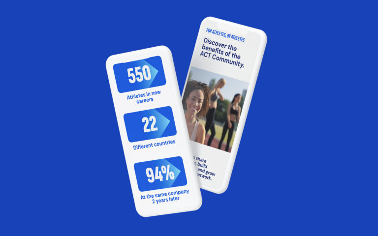
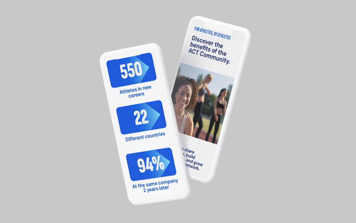
We designed ten core pages: Home, For Athletes, For Businesses, For Sporting Organisations, Join ACT Community, About ACT, ACT Trailblazers, Latest News, Work at ACT, and Contact Us. Each audience pathway leads visitors deeper based on their needs — athletes find career support tools and success stories, businesses discover the talent pipeline, sporting organisations see partnership models.
Mobile-first wasn’t a checkbox. It was a design principle. Athletes check opportunities between training sessions. HR leaders review profiles during commutes. The interface needed to perform at every screen size without sacrificing visual impact.
Navigation mirrors ACT’s service structure. Clean, intuitive pathways that don’t require a tutorial. We prioritised reducing friction between interest and action — an athlete should move from “this looks interesting” to “I’m in” without barriers.
The pixel-perfect UI designs came with a complete design system: buttons, icons, form elements, spacing rules. This wasn’t just for us. It was for whatever development team would build and maintain the site long after handoff. A design without a system is a snapshot. A design with a system is infrastructure.
ACT Community went from a logo with potential to a brand with presence.
Every touchpoint now speaks the same language. LinkedIn posts, sales decks, athlete onboarding materials, partnership proposals — they look, sound, and feel like they come from the same organisation. That consistency didn’t exist before.
The three-audience challenge resolved itself through smart architecture. Athletes see energy, possibility, and support. Businesses see professionalism, rigour, and talent pipeline value. Sporting organisations see a partner that understands their world. Same brand. Different emphasis. Coherent throughout.
Internal teams now have tools they can use independently. The template system means ACT doesn’t need a designer every time they build a presentation or publish a report. The brand guidelines serve as a practical reference — not a dusty manual — ensuring anyone creating content on behalf of ACT maintains the standard.
This project was delivered through The Formation Group’s Matchmaking Service, which connects growing organisations with hand-picked senior specialists from its trusted network of marketing, creative and communications experts. By matching ACT Community with Patten Design, Formation ensured they had exactly the right expertise for the challenge — combining strategic thinking, specialist design skills and agile delivery without the cost or complexity of a traditional agency model. The result is a stronger brand, a better digital experience and a partnership built around expertise rather than headcount.
Your existing brand might be
confusing your best customers.