It’s the most common brief I receive: “We need a logo.”
Sometimes that’s exactly right — a focused piece of work, a clear visual mark, done well. But more often, the conversation reveals something else. The business has outgrown its existing brand. The positioning has shifted and the visual expression hasn’t followed. Or they’re starting something new and need to look the part from day one.
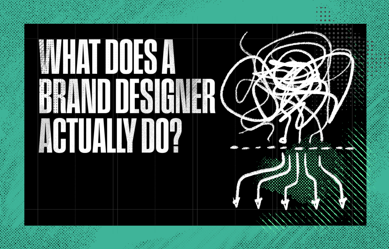
In those situations, a logo alone won’t do it. And understanding why requires getting clear on what a logo actually is — and what a brand is.
What a logo is
A logo is a mark. A visual device — a symbol, a wordmark, a combination of both — that identifies your business. Its job is recognition. When someone sees it, they know it’s you.
Done well, a logo does that job consistently across every size and every surface: a business card, a website, the side of a van, a favicon in a browser tab. It’s flexible, it’s distinctive, and it holds up across contexts.
That’s not a small thing. A poorly designed logo — one that breaks at small sizes, loses meaning in black and white, or simply doesn’t feel right for the business it’s supposed to represent — will cause problems every time it’s applied. Getting the mark right matters.
But a logo, however well-designed, is still only a mark. It’s the signature, not the letter.
What a brand is
A brand is the complete experience someone has of your business — what they see, what they read, what they hear, what they feel, and what they remember. It’s the sum of every impression your business makes, from a website visit to a phone call to the invoice you send at the end of a project.
The logo is part of that. But it’s a small part.
A brand includes the values your business actually operates by, even when no one’s watching. It includes the story you tell about why you do what you do. It includes the specific personality — the tone, the language, the way you approach problems — that makes your business feel like itself rather than like everyone else.
And then there’s the visual identity, which is the designed expression of all of that: the logo, the colour palette, the typography, the graphic language, the way images are chosen, the way layouts are structured. This is the system that makes your brand recognisable and coherent across everything it touches.
A logo without this system behind it is like a front door without a building. It might look fine. But there’s nothing behind it.
Where the confusion starts
Most founders, when they first think about branding, think about the logo. That’s understandable — it’s the most visible element, the thing that appears on everything, the part you can point at. It’s concrete in a way that ‘brand strategy‘ often isn’t.
So they commission a logo. Sometimes they do this very early — before they’ve really worked out what the business stands for, who it’s for, or how it wants to be perceived. The logo gets made. It might even look good. But then the website has a different feel. The colour palette was chosen quickly and doesn’t quite fit. The tone of the proposal doesn’t match the visual identity. Nothing is quite consistent, and nothing quite adds up.
The business looks functional. It doesn’t look like itself.
This is how most brand problems start — not with bad design, but with incomplete design. Design that addressed the logo without addressing the system it’s part of.
What a full identity system actually includes
When I talk about brand identity — the designed expression of a brand — I mean a set of interconnected elements that work together as a system.
The logo is the starting point: a primary mark, usually with secondary variations for different contexts (a compact version, a symbol alone, a reversed version for dark backgrounds). Every business needs these because logos appear in too many different places and sizes to have only one form.
Colour is more strategic than most people realise. A palette isn’t just a set of colours you like — it’s a set of colours that carries meaning, works across digital and print, contrasts correctly for accessibility, and holds up in black and white when needed. The difference between a thoughtful palette and a careless one is immediately visible, even if people can’t always say why.
Typography sets the register of everything written. A typeface that’s been chosen deliberately — for its personality, its legibility at different sizes, its relationship to the logo — tells people something about the business without them consciously registering it. Typography that’s been grabbed from a free font site tells them something too.
The visual language extends beyond these elements: the way images are selected and treated, the graphic devices and textures and patterns that appear across marketing materials, the structural logic of how pages and documents are laid out. These are the elements that make a brand feel coherent even when the logo isn’t present.
And then there are guidelines — a practical document that captures how all of this works and why, so that the system can be applied consistently by anyone who needs to use it: the person building the website, the designer creating a social template, the team member putting together a presentation. Without guidelines, identity systems degrade. With them, they compound over time.
Why businesses who buy only a logo often come back
The pattern I see most often is this: a founder, moving quickly, commissions a logo. The logo does its job for a while. But as the business grows — as the website gets built, as proposals go out, as the LinkedIn presence develops, as the business card gets printed — the lack of a proper system starts to show.
Nothing quite hangs together. The font on the website is different from the font in the proposal. The colours have multiplied without anyone deciding that was the right move. The business looks like it was assembled by several different people who’d never spoken to each other, because in a sense it was.
So they come back. And we do the thing we probably should have done at the start: build the system properly, from the strategy outward.
That’s not a criticism of the original decision — moving quickly is often right. But it does mean paying twice for some of the work, and losing time while the brand is sending mixed signals.
Where to start
If you’re building something new, or you’ve outgrown the brand you started with, the question to ask is: do I need a logo, or do I need a brand identity?
If you genuinely just need a mark — you have a clear visual direction, the positioning is solid, and you just need the design executed — then a focused logo project might be the right brief.
But if the positioning is still forming, or you need everything to hang together from launch, or the business has grown to the point where inconsistency is starting to cost you — then the work starts earlier, with strategy, and the identity follows from that.
I design both. But I always start with the strategy. Because a logo that comes out of clear thinking is always more effective than one that precedes it.
I’m based in Surrey and work with founders and SMEs across the UK — Surrey, South London, and beyond. If you’d like to talk about what the right brief looks like for where you are, the Brand Strategy service page is a good place to start.