– Brand Strategy – Logo – Brand Identity – Brand Guide – Website – Ongoing brand support
The Access Embassy help leaders cut through complexity and turn dialogue into action, so patients everywhere gain faster access to innovation.
See how we created a high-performance brand identity rooted in strategy. Turning complexity into clarity through the architecture of branding.
The Challenge
When Christel Jansen approached us, she had a clear vision but no brand architecture to support it. The Access Embassy was born from a simple truth: patient access work isn’t just policy analysis: it’s diplomacy.
Life sciences organizations face a maze. Policy landscapes shift daily. Stakeholders operate in silos. Regulatory frameworks change faster than most teams can adapt. Access Policy & Partnership leaders spend their days decoding complex environments while trying to align internal priorities, build external relationships, and keep patient needs at the center.
The problem? Most healthcare branding agency work treats this sector like any other B2B service. Corporate blue palettes. Stock photography of handshakes. Generic mission statements about “partnering for success.”
The Access Embassy needed something different. They needed a brand identity design that matched the weight of their work: serious but not sterile, authoritative but approachable, strategic but human.
I highly recommend Bob to founders and leadership teams looking for end-to-end support across strategy, branding, design, and website development.
Christel Jansen
Founder – The Access Embassy
The Strategic Insight
We started where we always start: with the truth of what they actually do.
The Access Embassy doesn’t just monitor policy changes or produce reports. They function as strategic partners for organizations navigating divided, uncertain terrain. They scan horizons. They build coalitions. They translate complex policy into actionable intelligence. They help clients speak with one unified voice when policy windows open.
That’s when it clicked. This isn’t consulting. It’s a mission.
The diplomatic framing became our north star. Just as embassies represent national interests abroad, The Access Embassy represents organizational priorities in the complex world of health policy. They gather intelligence. They foster relationships across opposing stakeholders: pharma, health systems, payers, patient advocates. They negotiate, position, and advocate.
Our brand strategy centered on this concept: Access work is diplomatic work.
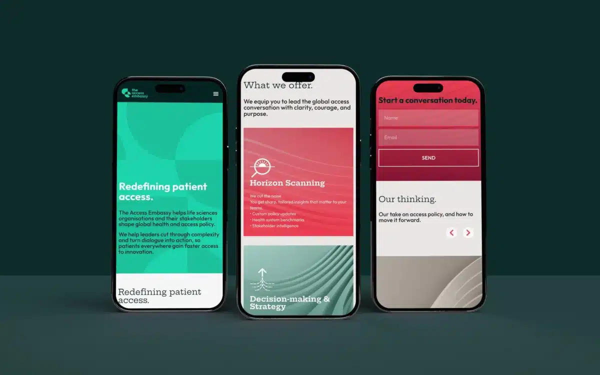
The Visual Identity
The identity design needed to match the substance. Healthcare branding often defaults to safe choices: muted colors, clinical imagery, forgettable typography. We went the opposite direction.
The logo balances authority with accessibility. Clean, confident letterforms that work across policy documents and digital platforms. Professional enough for boardroom presentations, distinctive enough to be recognized at conferences.
The color palette does real work. Deep navy anchors credibility. Lime yellow adds energy without feeling frivolous. It signals optimism, action, and forward momentum: exactly what’s needed when navigating complex policy landscapes.
We created a visual system that scales. From social media graphics to white papers, the brand maintains its presence without shouting. Icons represent each service pillar. Typography creates hierarchy. White space gives complex information room to breathe.
The brand guide we delivered isn’t a thick manual gathering dust. It’s a practical tool their team actually uses: clear guidelines on logo usage, color applications, typography, and tone of voice. Every page reinforces the same idea: your brand identity is shorthand for what your business stands for.
The Ongoing Mission
Brand strategy isn’t a one-time project. Markets shift. Organizations grow. Messages need refinement.
Our ongoing brand support keeps The Access Embassy sharp. We review new messaging before launches. We evolve visual assets as services expand. We provide strategic counsel when they’re making positioning decisions.
This matters especially for b2b branding agency work in complex sectors. Healthcare policy moves fast. The brand needs to stay relevant without losing coherence.
We’ve helped them launch new initiatives: The Access & Policy Academy, stakeholder innovation labs, policy publications. Each extension feels native to the core brand while serving distinct purposes.
What Changed
The Access Embassy now stands apart in a sector where most players blend together. Their brand communicates substance before they say a word.
Client conversations start from a position of clarity. They’re not explaining what they do: they’re discussing how they’ll work together. The diplomatic framing resonates immediately with Access Policy & Partnership leaders who live that reality daily.
Internal teams use the brand framework to structure their thinking. Service development follows the four pillars. Communications maintain consistency because everyone shares the same strategic foundation.
The brand does what strong brand identity design should: it makes the valuable visible. The work was always substantial. Now it looks and sounds like it.
The Architecture That Matters
Pretty logos don’t fix unclear positioning. Trendy websites don’t overcome confused messaging. Real branding for startups and growing organizations starts with strategy: understanding what makes you different, who needs to know, and how to communicate it with clarity.
The Access Embassy had the insight. They understood their market. They knew their value. Our job was building the brand architecture to express it all.
That’s the work that lasts. That’s what cuts through noise. Not because it’s loud, but because it’s true.